What is Storybook?
As explained in the tool’s documentation, Storybook is a user interface software development environment and playground for UI components. Its main purpose is to allow devs to create components independently in an isolated development environment outside of the main application. Storybook runs on its own web server and provides a catalog view for your application’s components – to get a better understanding of what it does, you can browse and play with example catalogs.
Storybook can be used with all of the most popular view layers, including React, React Native, Angular, Vue, and others. Moreover, you can include it in your existing application.
What are the benefits of using Storybook?
As you may expect, we wouldn’t devote an entire blog post to Storybook if it didn’t offer some substantial benefits to developers and other parties involved in the project work. The biggest advantage of this tool is that it provides a quick overview of all of the available components in one place. This comes in handy especially when you have dozens of different elements developed already and want to see or refresh how they look and behave. It’s just so much faster when you don’t have to go through different steps in the application to analyze the implemented changes and there’s no need to repeat every step to test every little modification you made.
Another major advantage of using Storybook is that it actually forces you to write code of higher quality. When you write components in isolation and don’t have to worry about specific app requirements, you focus on making them reusable. Keeping track of all the edge cases becomes easier and you can be sure that they are independent.
Then, there are also some benefits of Storybook that are experienced primarily by large teams. One example is that of stories which play an important role in documenting the code. They help teammates use components created by another developer by giving them visual guides, displaying different states, documenting component props, and showing use cases of components. Another example is that of Storybook exerting a positive impact on communication between different teams, including developers, designers, or even clients whom it gives a greater understanding of how the UI is built.
Last but not least, using Storybook helps you avoid UI bugs. In software development, a style change that works in one place can break something in another place, e.g. styling one state may break others. In such a scenario, the developer and the QA team can carry out a visual review for detecting UI regressions. Storybook also comes with add-ons that provide a way to conduct visual regression testing in order to keep the UI looking just as it’s been intended to look.
Getting started with Storybook
Having shown you what makes this particular tool special, we’re going to focus on how to use Storybook with React. In this section, we’ll guide you through the installation process, help you create your first component, and write a story for it.
Installation is very easy and to do it in the React project, you should follow these simple steps:
- Run: yarn add --dev @storybook/react
- Install necessary packages: react-dom, @babel/core, babel-loader
- Add “storybook”: “start-storybook” to scripts in package.json
- Create a folder named .storybook and config.js file inside with content:
import { configure } from '@storybook/react';configure(require.context('../src', true, /\.stories\.js$/), module);
This will search for .stories.js files inside src directory. Then create index.stories.js in src folderimport React from 'react';
import { Button } from '@storybook/react/demo';export default { title: 'Button' };export const withText = () => <Button>Hello Button</Button>;export const withEmoji = () => (
 <Button><span role="img" aria-label="so cool">😀 😎 👍 💯</span></Button>
);
Then, to start Storybook, write yarn storybook.
Stories
The base building blocks of Storybook are stories. A story is a function that represents the visual state of the component. In other words, it returns markup that will be rendered on the screen. From the 5.2 version on, Storybook changed its structure to match Component Story Format (CSF). This is an open format that can be used by other tools, such as story frameworks, testing libraries, etc. but you can still use the older storiesOf format (you actually have to in React Native as it doesn’t support the new format yet).
import React from 'react';export default { title: 'Button' };export const pink = () => <button className="pink">Pink Button</button>;
export const orange = () => <button className="orange">Orange Button</button>;
And here is how the same story looks like in storiesOf format:
import React from 'react';
import { storiesOf } from '@storybook/react';storiesOf('Button', module)
.add('pink', () => <button className="pink">Pink Button</button>)
.add('orange', () => <button className="orange">Orange Button</button>);
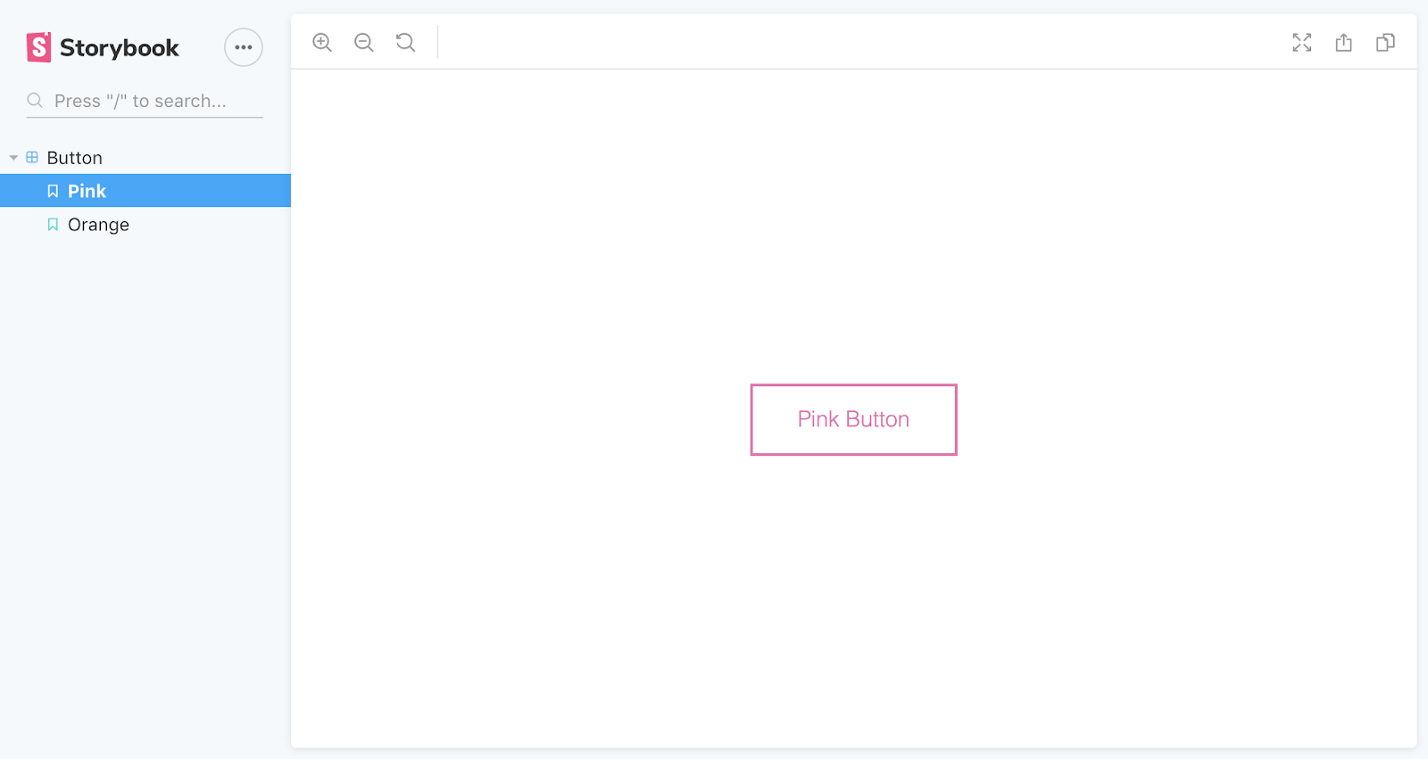
When you open Storybook page, it should look like that:

Addons
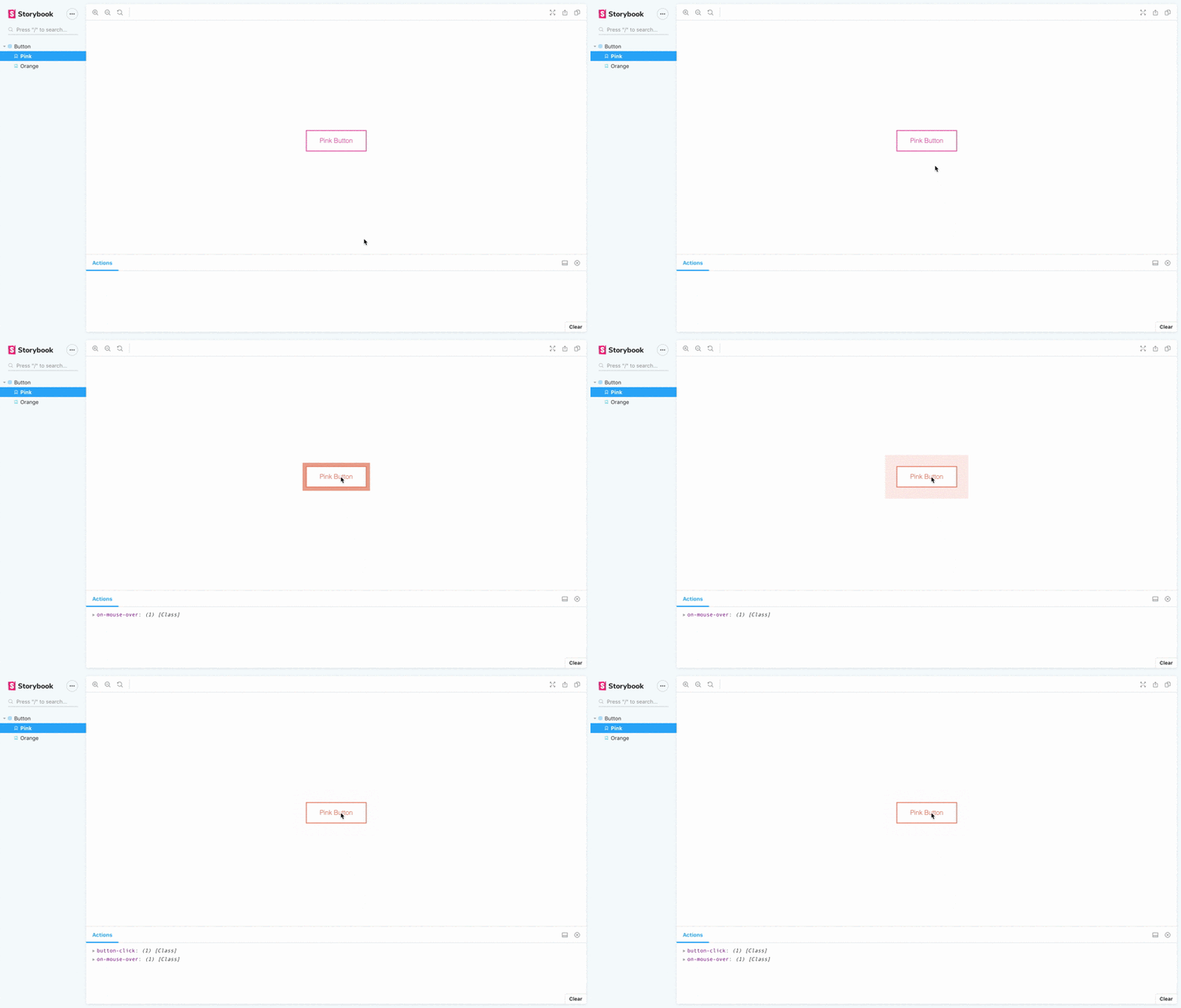
It shouldn’t come as a surprise that Storybook comes with a wide range of add-ons, both official and community-made, that allow us to adjust the component playground to suit our needs best. Among the ones, we find the most helpful is storybook-actions.

This addon helps to document and debug interactive components, through logging events that are triggered by user interaction, for example on click.
Storybook DocsPage
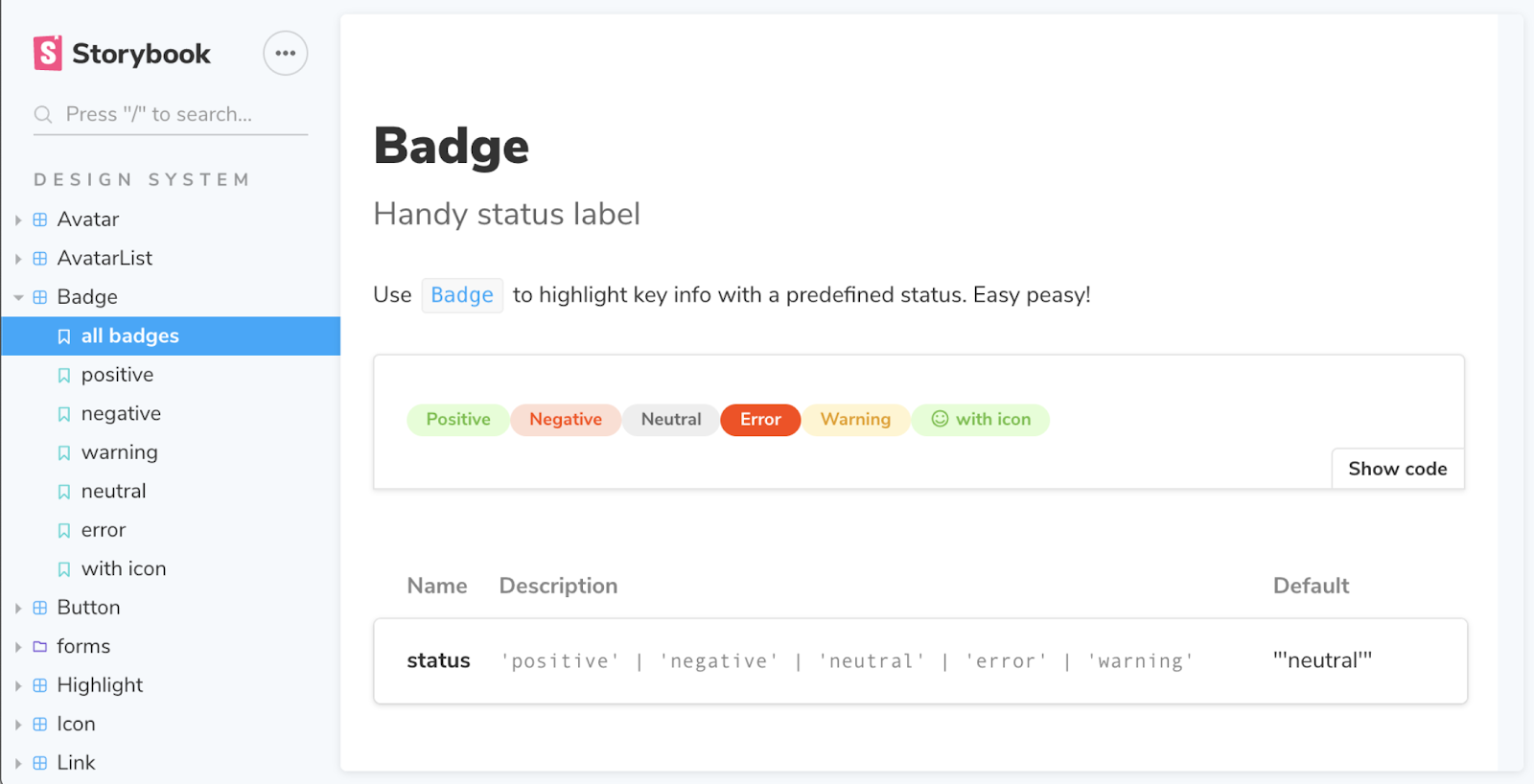
DocsPage is the newest plugin created by Storybook and implemented from version 5.2. It enables us to turn stories into a readable, high-quality document with no configuration. Each component has DocsPage auto-generated from existing Storybook that contains a description, primary story, props table, and a collection of stories:

Storybook
Thanks to this addon, you can create a whole design system without the need to write separate documentation.
At this point, it’s also worth mentioning that Storybook Docs introduced MDX support. MDX is a syntax for writing long-form documentation and stories side-by-side in the same file.
Speaking from our own experience: is Storybook always the answer?
Now that you’ve been properly introduced to Storybook with React, let us share with you a couple of lessons we’ve learned working with this tool.
We used Storybook alongside both Vue and React in Component Driven Development apps and – speaking from our own experience – we can confirm that the benefits mentioned at the beginning of the article are 100% true.
Storybook indeed accelerates the entire progress, helps QAs and designers prevent bugs or design inconsistencies from snowballing, as well as allows clients to access the result and assess the development progress before the first screens are made.
Sounds great, doesn’t it? Sure, but there’s always a “but”...
It all depends on the components
For simple reusable components that are either purely visual, have fixed data, or serve as simple containers receiving data, the use of Storybook is a no-brainer. What we have in mind are buttons, headlines, paragraphs, icons, wrapped images, and so forth. These elements and the Storybook environment seem to be a match made in heaven: in this scenario, the implementation of the stories is fast and we can be sure how a given component will behave when added to the application.
But there are also some larger and more complex components for which we need to use mocked data that are imported to the stories, e.g. sample API responses. Into this category fall elements like forms and modals, sliders, or infoboxes – in other words, components that are made of multiple simpler elements.
In this event, using Storybook involves much more than just creating stories. It entails not only mocking a larger amount of data but also providing Storybook users with the ability to manipulate multiple knobs of the large component and some of the smaller components inside. Sometimes, it even calls for adding logic within a story to make the component interactive and to enforce certain behavior upon it – the logic that would otherwise be implemented later on while developing a page or a view. In some cases, this very logic would be dependent on other parts of the application so mocking data for those parts may be required too.
As you can see, adding a complex component to the story is not exactly a piece of cake. In fact, it requires a lot of additional work that takes time and does not push the project forward per se.
Getting lost in the story or when not to use Storybook
At this point, you should be already suspecting where this argument is going to take us. Yes, you guessed it right – there are cases in which using Storybook does not help at all and in a moment you’re going to read about one of them. Here’s what Marek, the co-author of this article, has to say about it:
I was about to write a complex part of the application that used Storybook in most of the places so, out of habit, I created a component file and a story file next to it. I examined what needs to be done and wrote down steps I need to take to complete the task – just the usual order of things. It seemed, however, that completing this part would take much more time than I expected... and almost one-third of that time would be spent on implementing features necessary to run the component in the story.
Features that wouldn’t be accessible from the inside of the application and would serve the development purpose only. And as the component was not to be reusable and it would only appear in one part of the app, that work would've been simply a wasted effort. Had I followed my initial plan and carried on with Storybook in this particular case instead of developing the component inside the application itself and adding it to the page, I would've lost so much time just to use the tool that was supposed to speed up my process and make it easier.
So is it worth using Storybook?
Storybook is undoubtedly a tool with a considerable potential to speed up and facilitate the work of us, frontend developers, but also other IT professionals involved in a project. Maintained by active open-source contributors, it’s constantly improving and evolving. Not to mention that it requires little effort to significantly enhance the quality of the app. However, as our goal as developers is to use available means to provide high-quality software on time, we always need to question the effectiveness of different tools and be attentive to the situations in which a facilitator turns into an obstacle.
Bearing in mind the above-mentioned case, it might be a good idea to ask yourself the following questions when considering the use of Storybook in a given part of your project:
🔸 How accurate a given story needs to be?
🔸 Is having this particular component inside a story worth all this time that could be otherwise spent on implementing the same feature in the application itself?
🔸 Does using Storybook actually speed up and enhance the software development process in your case?
As far as the answer to the first question is concerned, if we decide to back down on the one-to-one accuracy of the component behavior in story and application, we may add additional work for the QA that will need to test the component again later on, outside of the story. When it comes to the remaining two questions if the answer is “no”, it most likely means that using Storybook with a given component for the sake of continuity only (as the solution is used in other parts of the project) may actually hinder rather than accelerate your work.
To sum up, we’re anything but Storybook naysayers: we believe it’s an astounding tool that we’ll continue using for years to come. At the end of the day, however, we need to stress out that the main argument for using any solution, including Storybook, should always be its usefulness and the value it adds to the project.
Do you feel like working with international clients using top-notch solutions? Join our frontend team and make your dreams come true!
.svg)


.svg)
.svg)
.avif)

.avif)
.avif)
.avif)
